Visualizing Data with Pair-Plot Using Matplotlib

By Kürşat Kutlu Aydemir
April 25, 2022

Pair Plot
A pair plot is plotting “pairwise relationships in a dataset” (seaborn.pairplot). A few well-known visualization modules for Python are widely used by data scientists and analysts: Matplotlib and Seaborn. There are many others as well but these are de facto standards. In the sense of level we can consider Matplotlib as the more primitive library and Seaborn builds upon Matplotlib and “provides a high-level interface for drawing attractive and informative statistical graphics” (Seaborn project).
Seaborn’s higher-level pre-built plot functions give us good features. Pair plot is one of them. With Matplotlib you can plot many plot types like line, scatter, bar, histograms, and so on. Pair-plot is a plotting model rather than a plot type individually. Here is a pair-plot example depicted on the Seaborn site:
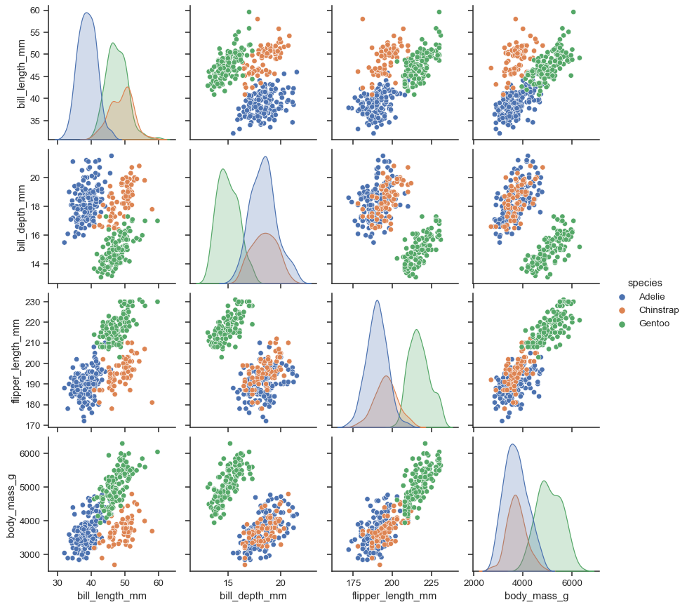
Using a pair-plot we aim to visualize the correlation of each feature pair in a dataset against the class distribution. The diagonal of the pairplot is different than the other pairwise plots as you see above. That is because the diagonal plots are rendering for the same feature pairs. So we wouldn’t need to plot the correlation of the feature in the diagonal. Instead we can just plot the class distribution for that pair using one kind of plot type.
The different feature pair plots can be scatter plots or heatmaps so that the class distribution makes sense in terms of correlation. Also the plot type of the diagonal can be chosen among the mostly used kind of plots such as histogram or KDE (kernel density estimate), which essentially plots the density distribution of the classes.
Since a pair plot visually gives an idea of correlation of each feature pair, it helps us to understand and quickly analyse the correlation matrix (Pearson) of the dataset as well.
Custom Pair-Plot using Matplotlib
Since Matplotlib is relatively primitive and doesn’t provide a ready-to-use pair-plot function, we can do it ourselves in a similar way to how Seaborn does. You normally won’t necessarily create such home-made functions if they are already available in modules like Seaborn. But implementing your visualization methods in a custom way give you a chance to know what you plot and may be sometimes very different than the existing ones. I am not going to introduce an exceptional case here but creating our pair-plot grid using Matplotlib.
Plot Grid Area
Initially we need to create a grid plot area using the subplots function of matplotlib like below.
fig, axis = plt.subplots(nrows=3, ncols=3)For a pair-plot grid you should give the same row and column size because we are going to plot pairwise. Now we can prepare a plot function for the plot grid area we created. If we have 3 features in our dataset as this example we can loop through the features per feature like this:
for i in range(0, 3):
    for j in range(0, 3):
        plotPair()
For cleaner code it is better to move the single pair plotting to another function.
Below is a function I created for one of my master’s degree coursework assignments in December 2021 at the University of London. Plotting a single pair in a grid needs to get the current axis for the current grid cell and identify the current feature data values on the current axis. Another thing to consider is where to render the labels of axes. If we were plotting a single chart it would be easy to render the labels on each axis of the chart. But in a pair plot it is better to plot the labels on the left-most and bottom-most of the grid area so that we won’t bother the inner subplots with the dirty labeling.
def plot_single_pair(ax, feature_ind1, feature_ind2, _X, _y, _features, colormap):
    """Plots single pair of features.

    Parameters
    ----------
    ax : Axes
        matplotlib axis to be plotted
    feature_ind1 : int
        index of first feature to be plotted
    feature_ind2 : int
        index of second feature to be plotted
    _X : numpy.ndarray
        Feature dataset of of shape m x n
    _y : numpy.ndarray
        Target list of shape 1 x n
    _features : list of str
        List of n feature titles
    colormap : dict
        Color map of classes existing in target

    Returns
    -------
    None
    """

    # Plot distribution histogram if the features are the same (diagonal of the pair-plot).
    if feature_ind1 == feature_ind2:
        tdf = pd.DataFrame(_X[:, [feature_ind1]], columns = [_features[feature_ind1]])
        tdf['target'] = _y
        for c in colormap.keys():
            tdf_filtered = tdf.loc[tdf['target']==c]
            ax[feature_ind1, feature_ind2].hist(tdf_filtered[_features[feature_ind1]], color = colormap[c], bins = 30)
    else:
        # other wise plot the pair-wise scatter plot
        tdf = pd.DataFrame(_X[:, [feature_ind1, feature_ind2]], columns = [_features[feature_ind1], _features[feature_ind2]])
        tdf['target'] = _y
        for c in colormap.keys():
            tdf_filtered = tdf.loc[tdf['target']==c]
            ax[feature_ind1, feature_ind2].scatter(x = tdf_filtered[_features[feature_ind2]], y = tdf_filtered[_features[feature_ind1]], color=colormap[c])

    # Print the feature labels only on the left side of the pair-plot figure
    # and bottom side of the pair-plot figure.
    # Here avoiding printing the labels for inner axis plots.
    if feature_ind1 == len(_features) - 1:
        ax[feature_ind1, feature_ind2].set(xlabel=_features[feature_ind2], ylabel='')
    if feature_ind2 == 0:
        if feature_ind1 == len(_features) - 1:
            ax[feature_ind1, feature_ind2].set(xlabel=_features[feature_ind2], ylabel=_features[feature_ind1])
        else:
            ax[feature_ind1, feature_ind2].set(xlabel='', ylabel=_features[feature_ind1])
Let’s go back to the initial plotting of the grid area and adjust the call of plot_single_pair function. We can adjust the figure size of the grid area using fig.set_size_inches depending on the feature count so that we can prepare a well-scaled area.
colormap={0: "red", 1: "green", 2: "blue"}

fig.set_size_inches(feature_count * 4, feature_count * 4)

# Iterate through features to plot pairwise.
for i in range(0, 3):
    for j in range(0, 3):
        plot_single_pair(axis, i, j, X, y, features, colormap)

plt.show()
In my plot-single_pair function notice that I also used a colormap dictionary. This dictionary is used to color the classes (labels) of the dataset to distinguish in a scatter plot or a histogram and makes it look more beautiful.
Here is my final grid plot function for pair-plot:
def myplotGrid(X, y, features, colormap={0: "red", 1: "green", 2: "blue"}):
    """Plots a pair grid of the given features.

    Parameters
    ----------
    X : numpy.ndarray
        Dataset of shape m x n
    y : numpy.ndarray
        Target list of shape 1 x n
    features : list of str
        List of n feature titles

    Returns
    -------
    None
    """

    feature_count = len(features)
    # Create a matplot subplot area with the size of [feature count x feature count]
    fig, axis = plt.subplots(nrows=feature_count, ncols=feature_count)
    # Setting figure size helps to optimize the figure size according to the feature count.
    fig.set_size_inches(feature_count * 4, feature_count * 4)

    # Iterate through features to plot pairwise.
    for i in range(0, feature_count):
        for j in range(0, feature_count):
            plot_single_pair(axis, i, j, X, y, features, colormap)

    plt.show()
Pair-Plot a Dataset
Now let’s prepare a dataset and plot using our custom pair-plot implementation. Notice that in my plot_single_pair function I passed the feature and target values as the numpy.ndarray type.
Let’s get the iris dataset from the SciKit-Learn dataset collection and do a quick exploratory data analysis.
from sklearn import datasets
iris = datasets.load_iris()
Here are the targets (classes) of the iris dataset:
iris.target_names
array(['setosa', 'versicolor', 'virginica'], dtype='<U10')
And here we can see the feature names and a few lines of the dataset values.
iris_df = pd.DataFrame(iris.data, columns = iris.feature_names)
iris_df.head()| sepal length (cm) | sepal width (cm) | petal length (cm) | petal width (cm) | |
| 0 | 5.1 | 3.5 | 1.4 | 0.2 |
| 1 | 4.9 | 3.0 | 1.4 | 0.2 |
Since iris.data and iris.target are already of type numpy.ndarray as I implemented my function I don’t need any further dataset manipulation here. Now let’s finally call myplotGrid function and render the pair-plot for the iris dataset.
Note that you can change color per target in colormap as you wish.
myplotGrid(iris.data, iris.target, iris.feature_names, colormap={0: "red", 1: "green", 2: "blue"})And here is my custom pair-plot output:
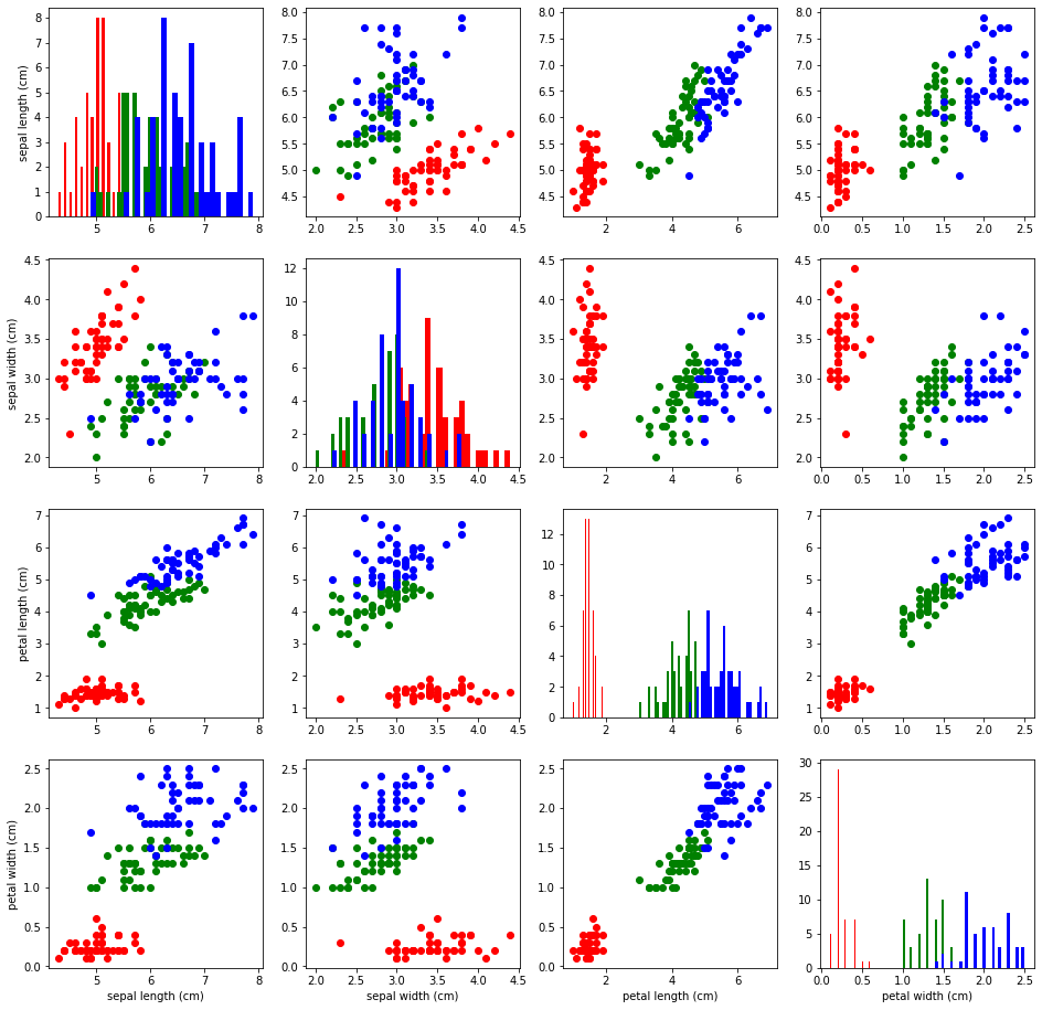
For further research I encourage you to go and do your exploratory data analysis and take a look at the correlation coefficient analysis to get more insights for pair-wise analysis.
python matplotlib visualization data-science
Comments