React: Style Tips

By Zed Jensen
September 28, 2019

Photo by Harpal Singh on Unsplash
I’ve worked on a couple of large React projects over the last few years. In my experience, one of the trickiest parts of getting a React project up and running is figuring out how you want to visually style your application in the browser, so I’ll share in this post some of the ways I’ve styled my projects.
CSS Modules
Libraries like Material-UI (which I’ll discuss next) do a lot of the work of styling for you. However, sometimes you’ll still need to define styles unique to your project, and the most common way is with CSS.
For projects created with create-react-app, any CSS you include in a React project isn’t scoped. This means that if you define a class tall in one component that has a height of 40 pixels and a class tall in another component with a height of 80 pixels, one of your rules will overwrite the other—whichever makes it into the compiled CSS file last. However, webpack allows you to use CSS modules, which restrict your CSS rules to components that explicitly import them. It took me a long time to figure out how to use them due to lack of relevant documentation, but eventually I discovered a very easy way to do it.
If your file structure looks like this:
- app/
  |-App.js
  |-App.css
It’s as simple as renaming your CSS file like this:
- app/
  |-App.js
  |-App.module.css
Using the suffix .module.css tells create-react-app that the rules within should be scoped only for where they’re imported. They can be used like other styles by importing and passing the classes like this:
import styles from './App.module.css';

export default function Component(props) {
  return <div className={styles.myClass} />;
}
Material-UI and similar libraries
There are many different design philosophies for web, but probably the most popular is Google’s Material Design. Material Design lays out some rules that help keep a user interface uncluttered, intuitive, and pleasant to use. However, jumping into the guidelines on Google’s website can be very intimidating. In addition, manually defining CSS for your web application is a lot of work. There are several different libraries that offer solutions to this, my favorite being Material-UI. Material-UI provides a set of components that you can reuse to put your application together.
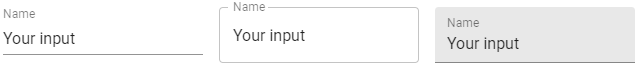
Here’s a simple example showing different styles of text fields:
import TextField from '@material-ui/core/TextField';

export default function TextFieldDemo(props) {
  render() {
    return (
      <form>
        <TextField
          label="Name"
          value={values.name}
          onChange={handleChange('name')}
        />
        <TextField
          label="Name"
          value={values.name}
          onChange={handleChange('name')}
          variant="outlined"
        />
        <TextField
          label="Name"
          value={values.name}
          onChange={handleChange('name')}
          variant="filled"
        />
      </form>
    );
  }
}
And here’s what that looks like:
Vanilla CSS with Material-UI
It’s also important to note that Material-UI’s preferred way of defining additional styles is using CSSinJS rather than plain CSS. Given the following CSS:
.button {
  margin: --theme-spacing
}

.input {
  display: none
}
You would instead use the following JSS object:
{
  button: {
    margin: theme.spacing(1),
  },
  input: {
    display: 'none',
  },
}
Using the styles in your project is mostly the same after that, but I won’t go into detail about that here. CSSinJS has some advantages (which you can read about in the Material-UI documentation as well as on the CSSinJS website), but I prefer vanilla CSS. It’s not immediately obvious from their site, but you can still use vanilla CSS as well as CSS modules with Material-UI, and setting it up is pretty simple.
First, you need to make sure that your CSS is injected before styles included with Material-UI. There are two steps to making this work: first, you define an injection point for your CSS by adding an element to your index.html at the injection point:
<head>
  <noscript id="jss-insertion-point" />
</head>
Then, you wrap the entire application in the StylesProvider component with a prop named injectFirst:
import { StylesProvider } from '@material-ui/styles';

class App extends Component {
  render() {
    return (
      <StylesProvider injectFirst>...</StylesProvider>
    );
  }
}
Now, your imported CSS will take predence over the styles provided by Material-UI, so you can still use vanilla CSS if you like!
Conclusion
These methods have worked great for me, but they’re certainly not the only way to do things. Leave a comment if you’ve found a library you like, or have an approach you recommend!
Comments