Regionation with PostGIS

By Josh Tolley
February 8, 2018
Recently a co-worker handed me a KML file and said, in essence, “This file takes too long for the Liquid Galaxy to load and render. What can you do to make it faster?” It’s a common problem for large data sets, no matter the display platform. For the Liquid Galaxy the common first response is “Regionate!”
Though your dictionary may claim otherwise, for purposes of this post the word means to group a set of geographic data into regions of localized objects. This is sometimes also called “spatial clustering” or “geographic clustering”. After grouping objects into geographically similar clusters, we can then use the KML Region object to tell Google Earth to render the full detail of a region only when the current view shows enough of that region to justify spending the processing time. Although the “Pro” version of Google Earth offers an automated regionation feature, it has some limitations. I’d like to compare it to some alternatives available in PostgreSQL and PostGIS.
Data sets
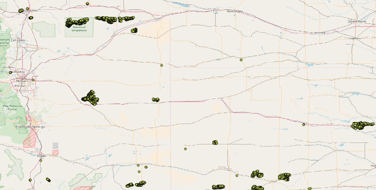
For this experiment I’ve chosen a few different freely available datasets, with the aim to use different geographic data types, distributed in different ways. First, I found a database of 49,000 on-shore wind turbines across the United States. The data set represents each turbine with a single point, and annotates it with its type, manufacturer, capacity, and many other characteristics. In this sample image, notice how the data are distributed, with compact clusters of many points, scattered sparsely across the landscape.
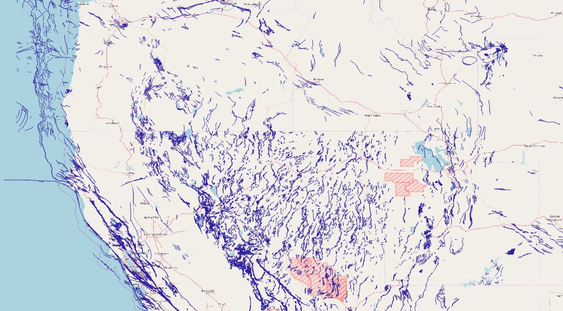
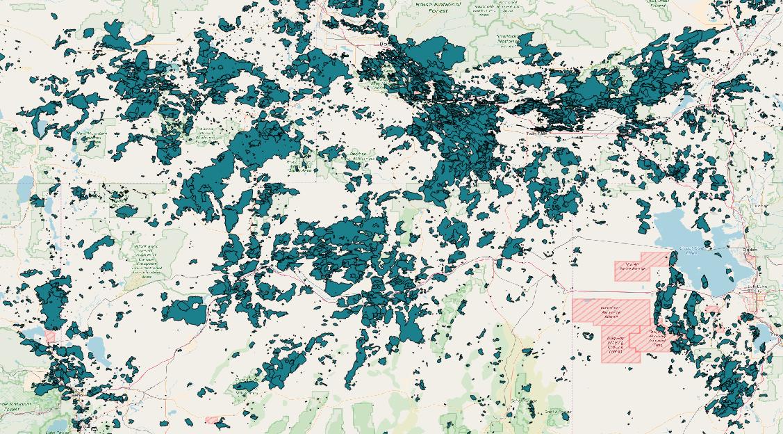
I wanted data sets with different types of geometric objects, so the second data set I chose describes geologic fault lines within the United States as multiple strings of connected line segments, comprising what’s known as a multilinestring object (see the OpenGIS Consortium Simple Features for SQL specification for more details on multilinestring data and other GIS data types in this document). Like the wind turbine data, this dataset also annotates each fault with other attributes, though we won’t use those annotations here. The faults are distributed in less obvious clusters than the wind turbines, though some clustering is still easily visible.
The last data set uses a third geographic type, the multipolygon, to represent the perimeter of wildfires in a portion of the western United States. The data set combines wildfire data from a variety of freely available sources, and though it may not be comprehensive, it serves nicely to experiment with regionating polygon data. Note that across the area covered by the dataset, the polygons are quite thickly distributed.
Regionating with Google Earth Pro
Having decided which data sets to use, my first step was to download each one, and import them into three different tables in a PostGIS database. The precise details are beyond the scope of this article, but for those interested in playing along at home, I recommend trying qgis. For data processing and storage, I used PostgreSQL 10 and PostGIS 2.4. Since my goal is to compare these data with Google Earth Pro’s built-in regionation tools, for the next step I created KML files from my PostGIS data with a simple Python script, and used Google Earth Pro to regionate each data set. Here I ran into a few surprises, first that Google Earth Pro doesn’t actually display anything but menus on my Ubuntu 16.04 system. The computer I’m using is a little unusual, so I’m willing to chalk this up to some peculiarity of the computer, and I won’t hold this one against Google Earth Pro. It certainly made testing a little difficult, as I had to use my Google Earth Pro installation for regionating, and either my Google Earth (note: not “Pro”) installation, or qgis, to view the results.
The second surprise was the sheer time it took to regionate these data. The wildfire and turbine data only took a couple of minutes, but my computer spent more than half an hour to regionate the faults data. My system isn’t especially high powered, but this still caught me off guard, and as we’ll see, the other regionation methods I tried took far less time than Google Earth Pro for this data set.
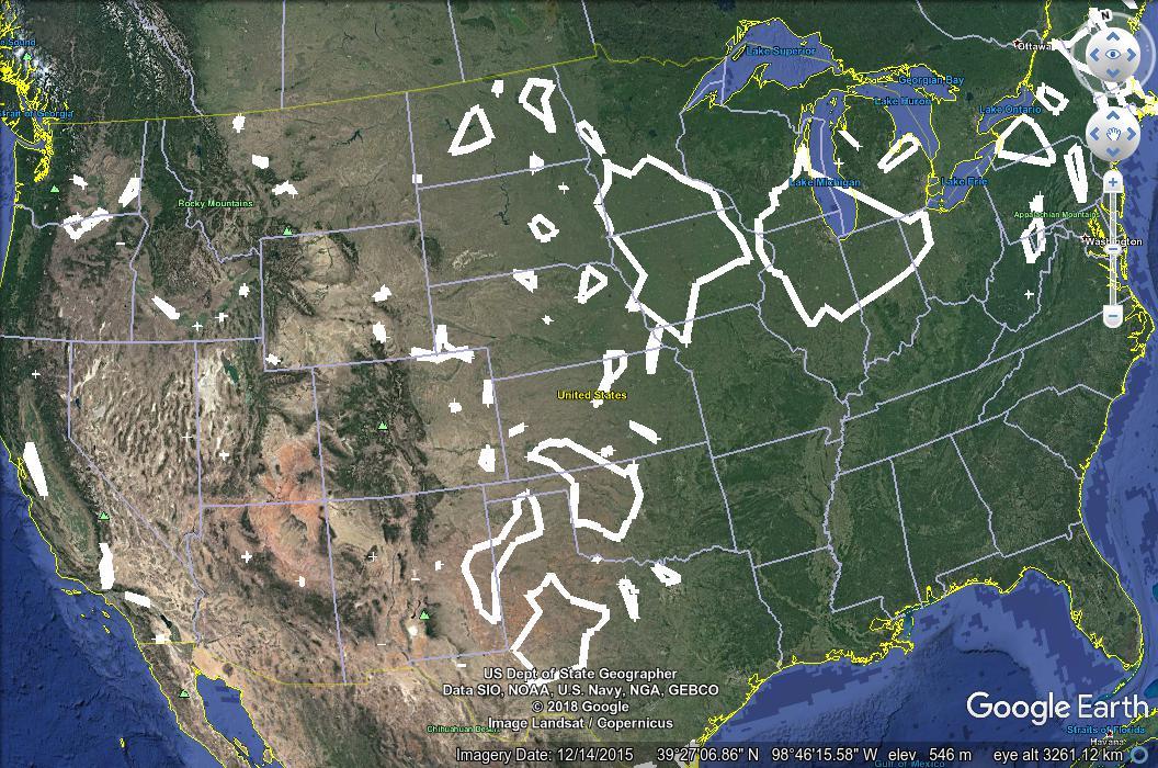
Finally, Google Earth Pro’s regionation system offers no customization at all; the user simply enters a KML file to regionate and a directory for the results. The PostGIS-based options, as we’ll see below, have parameters which affect the size and number of resulting clusters, but with Google Earth Pro, you’re stuck with whatever it gives you. For each of the three data sets, Google Earth Pro gave me thousands of KML files as output – just over 2000 files for the wildfire data, and over 17,000 for the faults data. Each file contains all the placemarks for one of the regions the system found. In any regionation problem I’ve had, the end goal was always to create a single, final KML file in the end, so in practice I’d likely have to reprocess each of these files (or rather, I’d write code to do it), but this isn’t much different from the other methods we’ll explore, which create tens, hundreds, or even thousands of database entries and which likewise need to be processed in software.
Basic regionating with PostGIS
PostGIS offers several functions to help us cluster geographic data. The two I used for this test were ST_ClusterKMeans and ST_ClusterDBScan. Both are window functions which calculate clusters and return a unique integer ID for each input row. So after making sure the table for each of my three data sets contained a primary key called “id”, a geometry field called “location”, and an empty integer field called “cluster_id”, I could cluster a dataset with one query, such as this one for the turbine data:
UPDATE turbines
SET cluster_id = cid
FROM (
SELECT
id,
ST_ClusterDBScan(location, 0.5, 3)
OVER () AS cid
FROM turbines
) foo
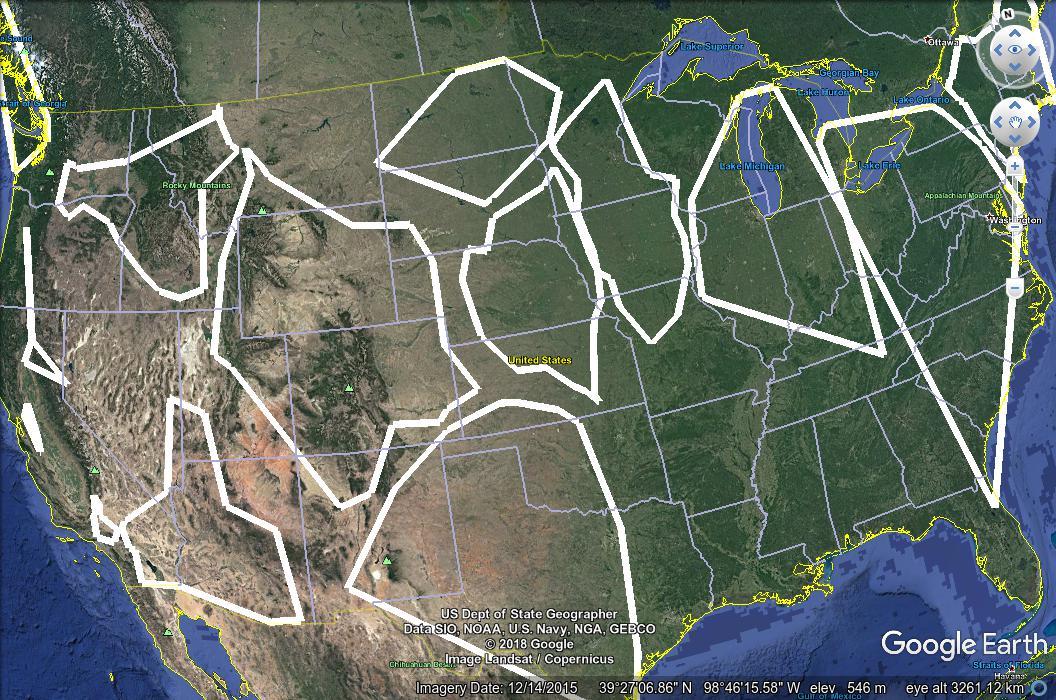
WHERE foo.id = turbines.id;The two functions I mentioned above have advantages and disadvantages for different situations, and I knew I’d want to experiment with them and their arguments, so I wrote another Python script to digest the clustering results and turn them into KML, to make it easy to compare different values and see which I liked best. When zoomed out, each KML files display an approximate outline of the group of objects in one region, and as the user zooms in, the objects themselves appear. For instance, in this screenshot from the wind turbine data set, you can see several regions outlined in white, and the individual turbines from one region appearing at the top of the image.
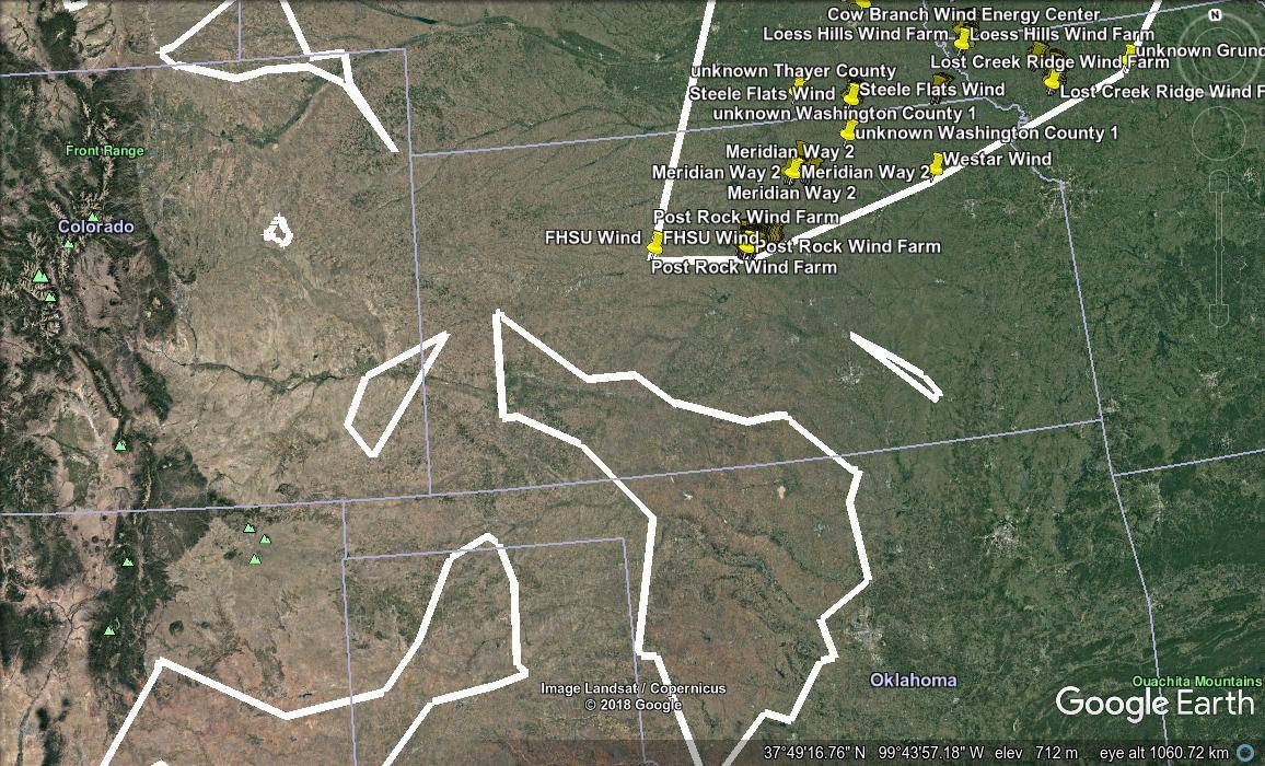
KML cognoscenti may note that regions defined in KML are always rectangular, but the shapes in the image above are not. In fact, the image shows “concave hulls” drawn around the objects in the region, the result of the PostGIS ST_ConcaveHull function. I outlined the regions with these hulls rather than with rectangles, to get a better idea of where the objects each cluster actually lay within the rectangular region. This was also helpful for another data set I was working on at the time, not described in this article.
To create these regions and the corresponding hulls, I need to know each region’s bounding box in latitude and longitude coordinates, and the hull to draw. The script gets that information like this:
WITH clusters AS (
    SELECT
        cluster_id,
        ST_Collect(location) AS locations
    FROM turbines
    GROUP BY cluster_id
)
SELECT
    ST_XMin(locations) AS xmin,
    ST_XMax(locations) AS xmax,
    ST_YMin(locations) AS ymin,
    ST_YMax(locations) AS ymax,
    ST_AsKML(ST_ConcaveHull(locations, 0.99)) AS envelope
FROM clusters;
PostGIS regionation functions
The two functions I mentioned deserve some further exploration. First ST_ClusterKMeans, which as you’d expect from the name, group objects using a k-means cluster algorithm. Its only parameters are the geometric data objects themselves, and the maximum number of clusters the user wants it to find. The algorithm will make the clusters as small as they need to be, in order to come up with the number the user requests, though of course it won’t generate more clusters than there are input data points.
The other function I used is called
ST_ClusterDBScan, an
implementation of the DBSCAN algorithm.
This algorithm accepts two parameters, a distance called eps, and a number of
points called minpoints. A discussion of their meaning is out of the scope of
this article; suffice it to say that modifying these values will adjust the
size and number of resulting clusters.
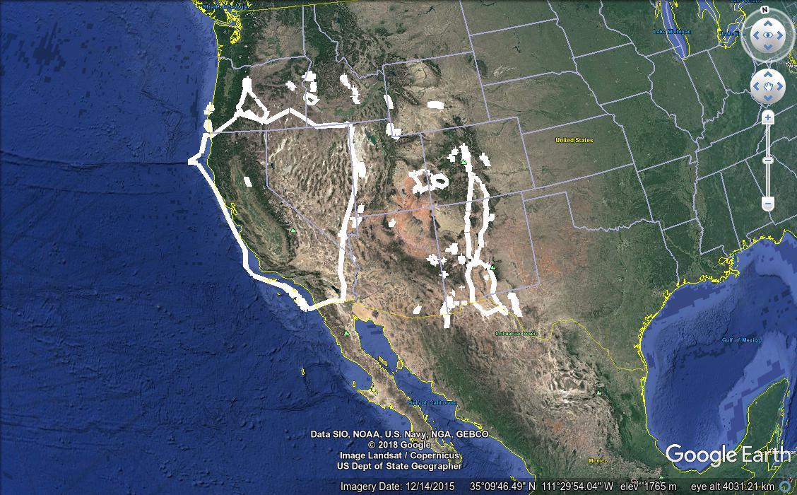
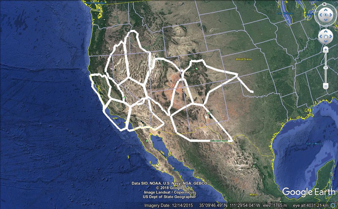
Which function works best for a given situation, and with which parameters, depends largely on the specific needs of the end user, as well as the type and distribution of the input data. For example, compare these two results, which regionate the faults data set using first DBSCAN, then K-means.
Aside from the obvious advantages of customizability, the PostGIS regionation is much faster than Google Earth Pro’s regionater. The DBSCAN clustering shown above took a bit over two minutes, and the K-means clustering was done in just six seconds. Of course this timing varies with different parameters, and it wasn’t terribly difficult to find a DBSCAN algorithm invocation that would take over ten minutes on the faults data. But that’s still an improvement over Google Earth Pro’s half hour run times.
Here’s another example, taken from the wind turbine data, again with the DBSCAN results first, followed by K-means.
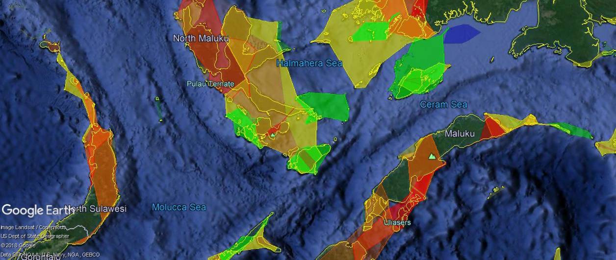
Applications
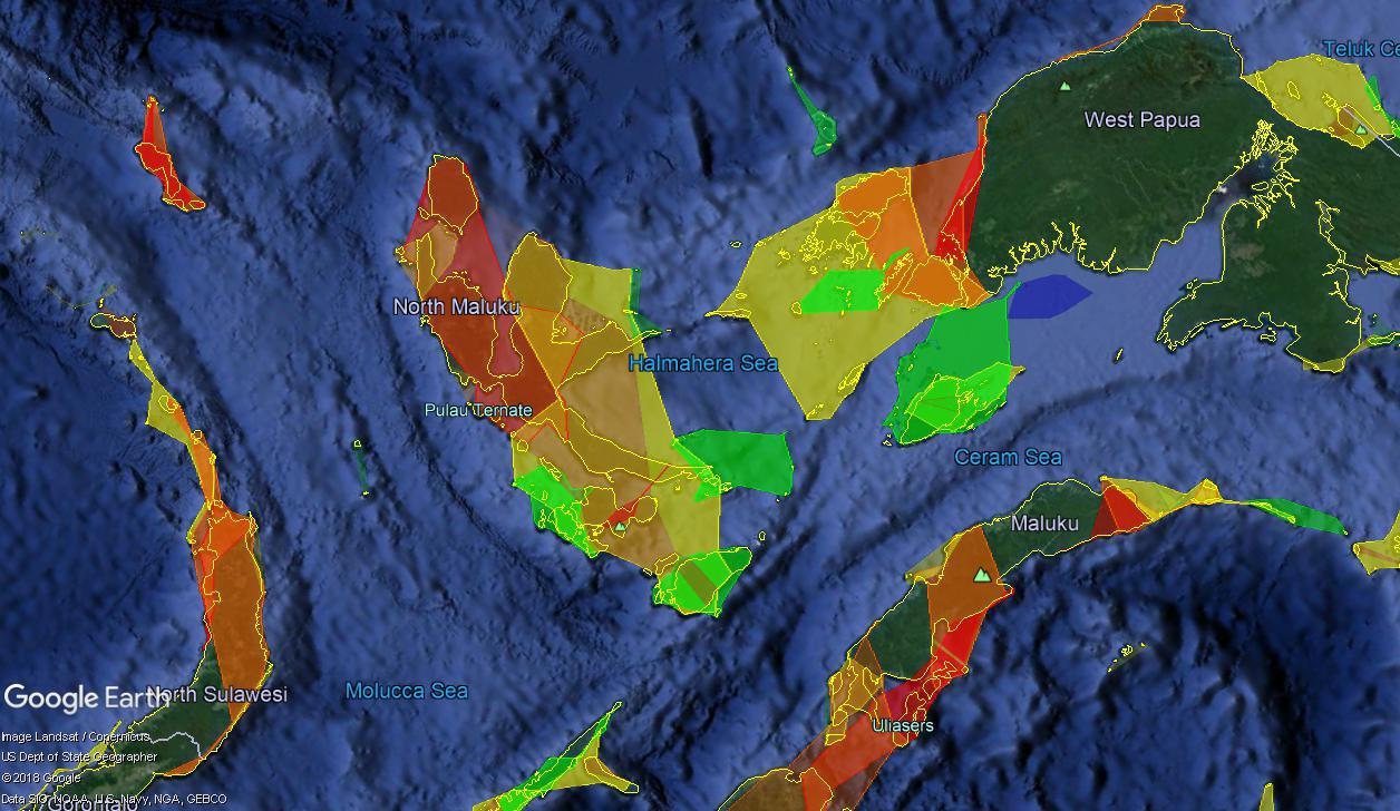
Obviously, beauty is in the eye of the beholder, and applications could be found for which both clustering systems were beneficial. I’ll finish with one more example from a data set I haven’t yet talked about. It comes from NOAA and shows coral reefs determined to be under threat from various risks, as well as the predicted development of that risk level through the year 2050. For these data, I envisioned regionating them so that when zoomed out, the user would see the general boundaries of a cluster, colored in a way that reflected the level of assessed risk. Zooming in, the user would see the large clusters fade into smaller ones, which in turn would fade into the full detail. This is where I began using the “concave hulls” mentioned earlier. KML Regions let us specify fades, so that one level of detail fades out as another fades in, and I used this along with two levels of clustering to create the data set shown in screen captures here. First, from a high altitude, the user sees the largest, least-detailed clusters, with colors representing the assessed threat.
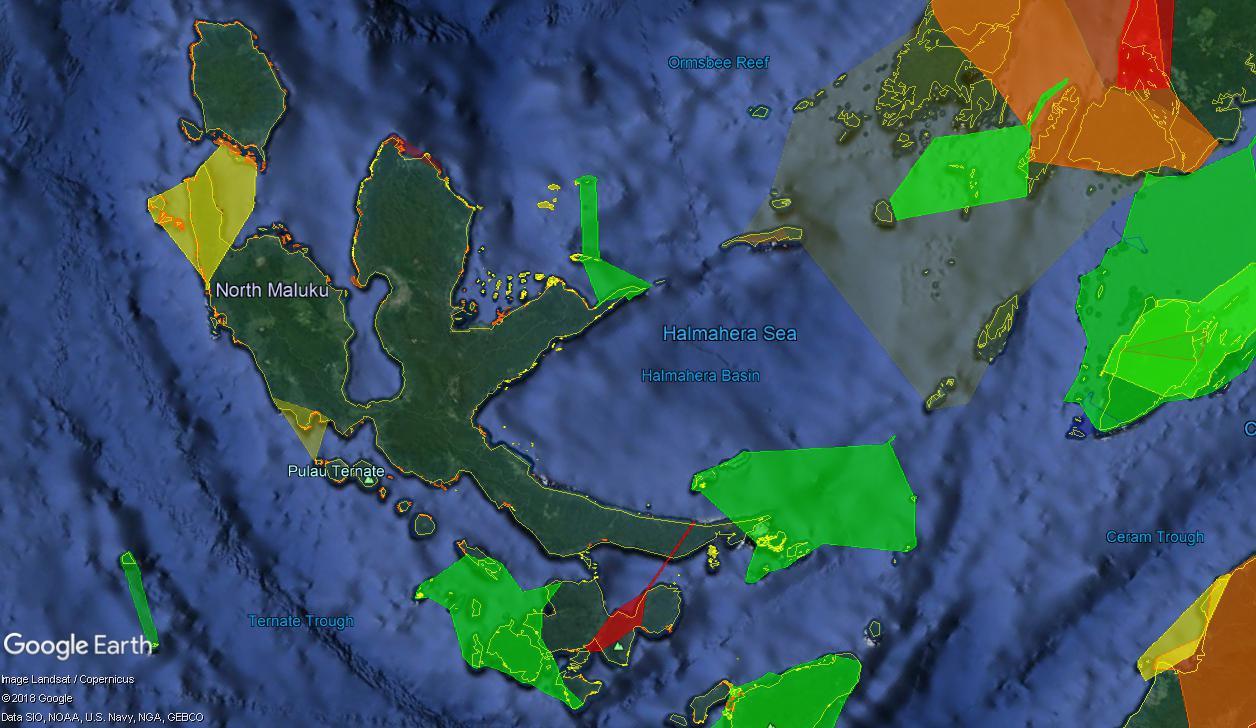
Zooming in, the larger clusters fade into smaller ones. Here you can see some of the most detailed layers already beginning to emerge. In the top right, you can also see one of the original clusters fading out.
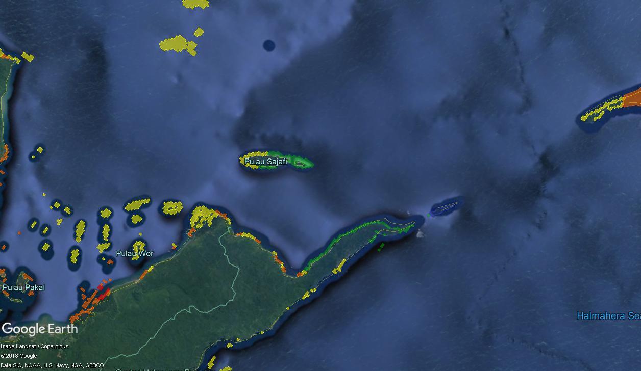
Finally, at even closer zoom levels, we see mostly the original reef data.
I find this presentation both visually beautiful, and technically interesting. Please comment on the uses you can envision for this sort of processing.
Comments