Building responsive websites with Tailwind CSS

By Afif Sohaili
December 3, 2021

Tailwind CSS is a CSS framework, like Bootstrap, Bulma, and Foundation. However, Tailwind does things in a less conventional way when compared to traditional CSS frameworks. Instead of providing CSS classes based on components or functional roles (e.g. .card or .row), Tailwind only provides utility classes, in which each class does only one specific thing a CSS attribute usually does, such as m-4 for margin: 1rem or mt-8 for margin-top: 2rem.
In Bootstrap, one can simply apply the provided .card CSS class to have a <div> styled like a card the Bootstrap way. In Tailwind, the styles have to be constructed with a string of different atomic classes. E.g. the equivalent of a Bootstrap’s .card would be something like relative flex flex-col break-words bg-white bg-clip-border min-w-0 rounded border. Verbose, yes, but this gives flexibility for the developers to define the appearance of a .card element themselves (e.g. there could be multiple variants of appearances of a .card) without having to worry about overriding inherited/cascading CSS classes, which are typically the cause of many CSS bugs in production.
Atomic CSS
The first thing most notice when developing with Tailwind is how wordy CSS class lists can get. It feels almost like using the style="" attribute to write CSS. In the traditional approach to CSS, suppose there are two elements with identical margins:
.card {
  display: block;
  margin: 1rem;
}

.container {
  margin: 1rem;
}
Here, we can see that margin is declared twice. Those duplicates are going to be a few extra bytes in the final CSS payload.
With Tailwind, however, this is how the equivalent would be written:
<div class="block m-4">
</div>

<div class="m-4">
</div>
Here, both of the <div>s are reusing the same class m-4, which is provided out-of-the-box by Tailwind. This approach ensures that the project’s CSS does not grow, which is important for good user experience. Constructing the CSS of a page is a render-blocking task in a web page load. So, the bigger the CSS, the longer the wait time for a user to see something on the browser. Yes, the HTML payload will grow, but just by a little.
One of the differences between using Tailwind CSS classes and using style attribute is that the latter cannot be used to style pseudoclasses (e.g. :hover, :disabled). With CSS classes, that is achievable, but there are special prefixes that Tailwind provides for each of the variants to take effect.
For example:
<!-- margin: 1rem by default, margin: 2rem on hover -->
<div class="m-4 hover:m-8"></div>

<!-- white background by default, light gray background when disabled -->
<input class="bg-white disabled:bg-gray-100"/>
Keep in mind that not all variants/pseudoclasses are supported by default, as this would make the development output of a Tailwind CSS file really big to cater all of the possible variants. To have them supported, it has to be configured inside the project’s tailwind.config.js:
// tailwind.config.js
module.exports = {
  variants: {
    extend: {
      backgroundColor: ['active'],
      // ...
      borderColor: ['focus-visible', 'first'],
      // ...
      textColor: ['visited'],
    }
  },
}
Or, if the project is on Tailwind CSS v2.1+, the developers can enable Just-in-Time mode, which grants access to all variants out-of-the-box while also being more functional in development mode.
See Just-in-Time mode for more details.
Shaking off the unused CSS
By default, Tailwind will be loading the whole Tailwind CSS project files, with CSS declarations on almost every possible CSS rule. There are a lot in there that a developer might never use. To put that into context, there are 105 different values just for grid and flexbox gaps. Most projects aren’t likely to use them all, so Tailwind needs a way to remove the unused CSS when generating the final CSS build for production use.
This is where PurgeCSS comes in. PurgeCSS is a plugin that analyzes all CSS, HTML, and JavaScript files in the project and removes unused CSS declarations from the final build. This tool is available as a PostCSS, Webpack, Gulp, Grunt, or Gatsby plugin.
Because PurgeCSS analyzes the project’s source code to find exact matches of a given CSS style, a CSS class cannot be used through string concatenations or PurgeCSS will not be able to detect that the given Tailwind class is used.
// SomeComponent.jsx
const SomeComponent = (props) => {
  return (
    <div className={'text-' + props.color}>
      Some text
    </div>
  )
}

// <SomeComponent color='gray-400'/>
// In this case, `text-gray-400` will be removed by PurgeCSS in the final CSS
// production build because it does not know that the component is using it.
DRYing it up
Suppose we have two cards on the page and we want their appearance to be consistent. In the traditional CSS approach, both these two cards will just have the .card CSS class, and the same styles would be applied to both of them. In Tailwind we can’t do that, however, and it doesn’t make sense to be repeating 7 or 8 or more different class names on both HTML elements on the page.
const AppButton = () => (
  <button className='py-2 px-4 font-semibold rounded-lg shadow-md'>
    I'm a button
  </button>
)

// Just use <AppButton> everywhere and their appearances will be consistent
// No need to repeat the CSS classes for all three components
render(
  <Form>
    <AppButton/>
    <AppButton/>
    <AppButton/>
  </Form>
)
Therefore, Tailwind can be easier to implement in component-based frameworks, such as Vue or React. But even if you’re not using any of them and are just building a plain HTML file, Tailwind provides a way to compose these classes together by using @apply:
.button {
  @apply py-2 px-4 font-semibold rounded-lg shadow-md;
}

.button.success {
  @apply py-2 px-4 font-semibold rounded-lg shadow-md text-white bg-green-400;
}
Then, .button and .button.success classes will be available to us for reuse as in traditional CSS.
<!-- py-2 px-4 font-semibold rounded-lg shadow-md gets applied when using "button" -->
<button class="button">I'm a button</button>

<!-- py-2 px-4 font-semibold rounded-lg shadow-md text-white bg-green-400 gets applied -->
<button class="button success">I'm a green button</button>
Building a responsive page using Tailwind
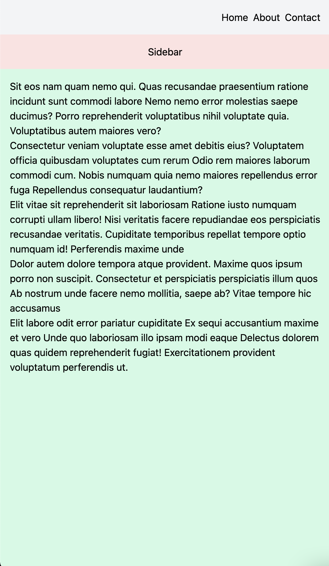
Now let’s look at responsive design. Suppose we want to implement a page with a navigation bar, a sidebar, a content area, and a footer:
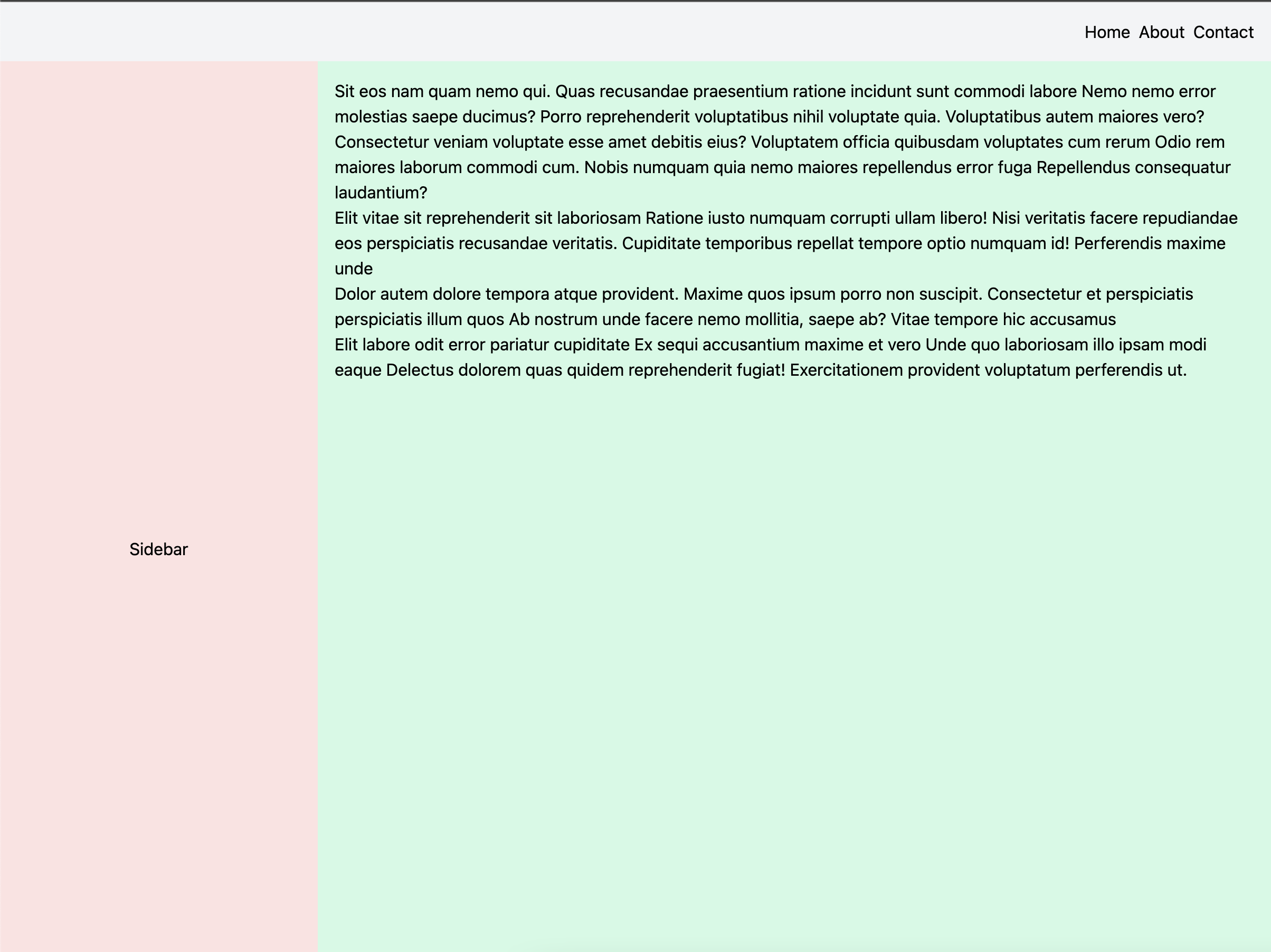
And the sidebar and content area should collapse into one column on mobile devices, like this:
First, let’s have the basic page layout:
<nav class="p-4 bg-gray-100">
  <ul class="flex gap-2 justify-end">
    <li>Home</li>
    <li>About</li>
    <li>Contact</li>
  </ul>
</nav>
<div class="flex flex-col">
  <aside class="flex items-center justify-center p-4 bg-red-100">
    Sidebar
  </aside>
  <main class="min-h-screen p-4 bg-green-100">
    <p>
      Sit eos nam quam nemo qui. Quas recusandae praesentium ratione incidunt sunt commodi labore Nemo nemo error molestias saepe ducimus? Porro reprehenderit voluptatibus nihil voluptate quia. Voluptatibus autem maiores vero?
    </p>
    <p>
      Consectetur veniam voluptate esse amet debitis eius? Voluptatem officia quibusdam voluptates cum rerum Odio rem maiores laborum commodi cum. Nobis numquam quia nemo maiores repellendus error fuga Repellendus consequatur laudantium?
    </p>
    <p>
      Elit vitae sit reprehenderit sit laboriosam Ratione iusto numquam corrupti ullam libero! Nisi veritatis facere repudiandae eos perspiciatis recusandae veritatis. Cupiditate temporibus repellat tempore optio numquam id! Perferendis maxime unde
    </p>
    <p>
      Dolor autem dolore tempora atque provident. Maxime quos ipsum porro non suscipit. Consectetur et perspiciatis perspiciatis illum quos Ab nostrum unde facere nemo mollitia, saepe ab? Vitae tempore hic accusamus
    </p>
    <p>
      Elit labore odit error pariatur cupiditate Ex sequi accusantium maxime et vero Unde quo laboriosam illo ipsam modi eaque Delectus dolorem quas quidem reprehenderit fugiat! Exercitationem provident voluptatum perferendis ut.
    </p>
  </main>
</div>
<div class="p-4 bg-yellow-100">
  <h5 class="font-bold">Footer links</h5>
  <ul>
    <li>Home</li>
    <li>About</li>
    <li>Contact</li>
  </ul>
</div>
Tailwind official documentation recommends taking a mobile-first approach. Hence, all classes without any screen-size variants will be applied to all screen sizes. Tailwind then provides several screen-size variants such as sm, lg, xl, and 2xl that can be used to control the appearance on specific screen sizes range.
This is what we’re doing here. As you can see, we’re using flexbox layout to collapse all elements down to a single column.
Responsive variants
Now, let’s add Tailwind’s responsive variants so that the page is responsive to screen sizes. In our case, what we would want is to have aside and main placed side-by-side when there’s enough real estate on the screen. To achieve that, we would need to switch the flex-col class to flex-row on bigger screen sizes.
<div class="flex flex-col md:flex-row">
  <aside class="flex items-center justify-center p-4 bg-red-100 md:flex-none md:w-1/3 lg:w-1/4">
  <!-- sidebar -->
  </aside>
  <main class="min-h-screen p-4 bg-green-100">
  <!-- main content -->
  </main>
</div>
flex-col md:flex-row here does the trick for us. md variants, by default, kick in when the screen width is at a minimum of 768px. At that point, our flexbox will change from the column layout to the row layout, displaying our aside and main elements side-by-side in one row. To better distribute the width, we specify md:w-1/3 and lg:w-1/4 classes to the sidebar. w-1/3 and w-1/4 sets the width of the elements to one-third and one-fourth of the parent container respectively. The md and lg variants both control at what screen sizes should Tailwind apply which styles.
Conclusion
It can be a bit daunting to start, but once you get a handle on it, Tailwind CSS is a great option for rapidly building user interfaces with total control over the styles. Unlike other frameworks, Tailwind does not attempt to provide a default styling of any component, allowing every site that uses Tailwind to be truly unique from another.
These responsive variants can be applied to any other CSS class from Tailwind, providing a powerful way to build responsive user interfaces. The very thin abstraction over CSS provides developers with a greater flexibility and control over the design while being a good constraint to guide the development process.
Happy styling!
Comments