Case Study: Responsive Design Return on Investment

By Elizabeth Garrett Christensen
July 21, 2016
Responsive design has been a hot topic in the e-commerce world for several years now. End Point has worked on many sites over the last few years to transition clients to a responsive design website model. While many large sized retailers have already transitioned to a responsive design, there are many smaller e-commerce sites that are still on an older design model and I would like to show that the return on investment for those stores is still noteworthy.
The lead of our Interchange team, Greg Hanson, led a responsive design project and I’d like to summarize that work on our blog. For confidentiality, I am leaving out the client’s name in this case.
Why Go Responsive?
There are two main reasons every e-commerce website, even a small one, needs to become responsive:
- Your customers
The march toward mobile sales at this point is undeniable and unstoppable. As more and more people become comfortable using their phones and tablets to purchase things, the bigger this market share will become. Also, Google has begun de-prioritizing websites that do not cater to mobile users. If you are waiting to go responsive because of budget, you might surprised to learn how dramatically the mobile revenue increased for the customer in this case.
Goals
This client is a small e-commerce business with a heavy ‘on’ season and ‘off’ season where the business owners could focus on this project. They wanted:
- To accommodate the increasing mobile user base; they knew it was there from looking at their Google Analytics.
- To increase revenue from mobile users. They could see that they had a 10% mobile user base, but they were converting only a small percentage.
End Point’s strategy
Our strategy with this small client, to minimize impact to the business and cost was to:
Use Bootstrap
Bootstrap is one of many front end frameworks that allows you to create a design template and roll that out to all the pages within a website without having to re-code each and every page in a website. This dramatically increases the speed and decreases cost.
Break up the work into segments
In this case, we had a three phase approach:
- Phase I, redesign the site using Bootstrap but still at fixed width
- Phase II, site checkout sequence changed to responsive
- Phase III, entire site responsive
The Project
Converting the site to Bootstrap was the biggest chunk of the time and money spent on this project. Since we knew this would be the foundation for the changes to come, we took our time getting it right, keeping the client involved every step of the way. We didn’t want to get in the way of their busy season either, so we completed that project and waited a half a year to begin the next piece.
The second step was updating checkout sequence to be responsive since this was arguably the hardest part about using the non-responsive site on a mobile device. The client considered this piece top priority. Plus, since it was only a few pages, it allowed us all to better understand the scope of coding the rest of the site and give the client an accurate picture of the budget.
Last, once we had a responsive checkout sequence, we changed the rest of the internal pages to be responsive and rolled out the entire site as responsive and mobile friendly.
Results
The first time we looked at the analytics following the responsive conversion, we were shocked! Using a small sample period, from just a year prior, we saw a 280% increase in mobile purchases.
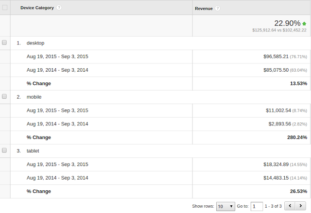
The timeframe for these comparison numbers was August 2014 before the responsive transition and August of 2015, after the transition.
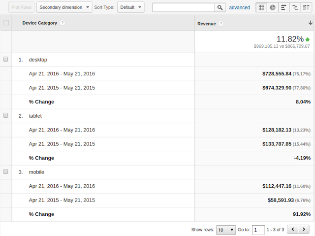
To sanity check those numbers, we just re-ran some of the analytics recently and in May of 2016, revenue from mobile users is still up over 90% and the clients total revenue year-over-year is up 12%.
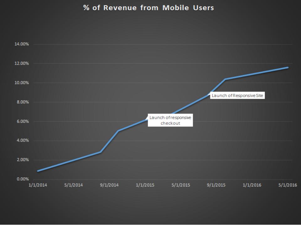
We also ran some numbers on the growth of mobile revenue as a percentage of overall revenue through this process. As you can see, two years ago mobile revenue was less than 1% and is now near 12%.
In this case, I didn’t go into all the ways to slice and dice the numbers in Google Analytics. However I’m happy to speak with you if you want to know more about mobile users, this client’s data, or how responsive design might help grow your e-commerce business.
The Lesson
The lesson here is that any store will benefit from going responsive. Having an experienced partner like End Point that can work with your budget and timeline can make this is a doable project for any size store and budget.
clients design mobile case-study
Comments