Mooving to the Mobile Web

By Kirk Harr
November 21, 2013
With the rise of the myriad of mobile phones, tablets and other devices that are connected to the internet, the potential users for a given website have both increased in number and morphed in their needs in terms of a user experience. As anyone who has attempted to use a website not designed for a mobile phone browser with frantic pinch-zooms to find a tiny page control, right next to four other controls that do something totally different in a menu, can attest this is really not ideal.
And meanwhile from the other perspective, for web developers, the notion of a fragmented user base over everything from a desktop PC with a modern browser to an embedded PC built into my new LCD TV needing to view your pages gracefully can be a scary prospect. The thought of maintaining independent versions of your web infrastructure that fit each of these major use cases would likely scare everyone in your company, especially the finance people cutting all the checks.
So what is a company facing this new reality of the modern web to do? One particular solution can help to alleviate one of the more troublesome issues with new devices browsing the Internet, mobile phone display. While the phones themselves are starting to come with resolutions comparable to a modern desktop or laptop PC, the screen size relative to your finger that is selecting inputs, leaves a far less precise pointer than a mouse. This is precisely the problem described earlier, as those page control designs with multiple options in a menu, comes from the design era when a precise mouse click as the input method was the norm. Additionally, with the smaller screen size, it is necessary to more prominently highlight certain aspects of the page design, like images of featured products, to keep the same level of emphasis of those images on the user who will view them.
One firm that is implementing a version of this solution that I recently helped implement for a client is Moovweb. For web developers, this technology will allow them to accomplish those goals of making page controls more usable on mobile phones, make featured elements of page layout stand out more effectively on a mobile phone browser, without actually maintaining a separate version of their site, optimized for mobile users. Moovweb will make a request to your site, optimize the content for mobile (behind the scenes) and the send that optimized response back to the user’s device. In this manner, the page contents will always be updated automatically for the mobile sites, based on what is present on your current live site. Which page elements are selected to be displayed on the mobile page, and how they are displayed are all configurable options within Moovweb’s controls, and you are also able to use a number of pre-built templates based on web software packages that are common.
Technical Details
How does Moovweb accomplish this sleight of hand—tailoring the response based on the device requesting the information? The secret lies both in JavaScript and DNS. Firstly, in order to setup your domain for Moovweb, you need to create a sub-domain that requests from mobile devices would be forwarded to, which would actually point to Moovweb with a CNAME record. Here is an example from the setup documentation:
If your domain was example.com, and the mobile sub-domain you had selected was m.example.com you would create a CNAME record for:
m.example.com. IN CNAME m.example.com.moovdns.net.
This would point any request to m.example.com over to the Moovweb servers, which will then carry out the forwarding of the requests back to the mobile browser of the user once the template had been applied to the page design and crafted the mobile version of the site.
For the JavaScript setup, a <script> tag must be added to the design of each page’s
tag in order to perform redirection of requests for mobile browsers. This script that is added is created for each customer by Moovweb, and is used to match the User-Agent setting of each request against a list of known mobile browsers. Conceivably, with this in place on every page, whether the user is attempting to load the main page, or perhaps a deeper link to something like a product page or category page, every request from the mobile browsers should be automatically redirected to the mobile domain that we setup the CNAME record for.How it looks
When working on deploying Moovweb for a client, tigerdistrict.com, I was introduced to the technology for the first time, and I was impressed with the mobile site experience. The page controls that were modified to make them easier to tap with your finger, and also making the page layout more portrait which fits the mobile phone form factor. Here are some examples of the mobile and non mobile site:
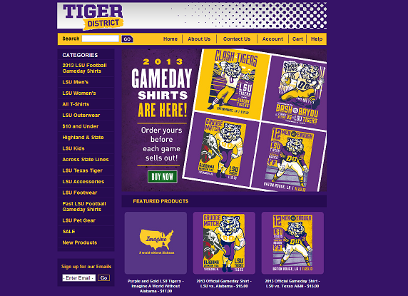 |
| Desktop Version |
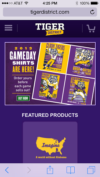 |
| Mobile Version |
One of my favorite features was how Moovweb could handle page navigation menus, like the one you see on the left margin of the page in the desktop version. On a mobile device, attempting to get a precise enough point to select only the correct one of those options, and not mistakenly clicking others, would be painful to say the least. However after the site has been converted to the mobile version, two new page elements are added to the bar at the top of the page. There is a cart icon representing the all important shopping cart, and one of the legendary “Hamburger button” controls that opens up the page navigation menu. Here is what it looks like on the mobile browser:
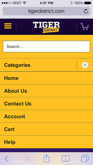 |
| No Dialing Wand Needed |
As you can see, it replicates the same menu tree, with the same ability to expand into any of the available categories, or use the text search, all within an interface that is easy to use within a mobile browser.
The Future of the Web — Devices, Devices, Devices
One thing is clear from the rise of mobile devices and tablets on the web over the past few years, is that these devices are here to stay, and if anything will continue to grow and dominate the marketplace. For developers seeking to harness, or even to just stay ahead of this trend, will need to address the problems of mobile browsers and the limitations of the devices themselves.
Creating websites that provide a desirable user experience to these many flavors of devices can be a daunting challenge, but in a way this shows us that the true issue is not the fragmentation itself. The real benefits from this type of mobile web development take advantage of your existing infrastructure, and gives you a method to tailor it as best you can to fit each of these new device’s abilities. Duplicating effort is wasteful and maintaining multiple versions the the same content with slightly different presentation is an example of this wasted effort. Reusing the current web infrastructure already available and already being invested in the maintenance of, allows the presentation of these multiple user experiences in a cost effective way.
Comments